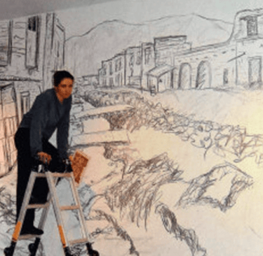
Our Journey into Art Collecting
Over 55 years of art collecting has resulted in a personal and also appealing art collection.
During the time i worked for the Gemeentemuseum Den Haag i met artists personally which resulted in a lifetime relationship with many of them and following their careers after.
Acquisitions in artists studio's and through auctions made it the collection it now is. Paintings, drawings , sculpture, photographs and video art are all present and in the background there is the vast collection of www.ftn-books.com with over 20.000 items all related to art available and acting as a personal reference. However these pages focus on the art in the collections which is for sale. For all inquiries please use: wilfriedvandenelshout@gmail.com
Artists present in FTN and S&O art collections
Discover our collection of promising and talented emerging artists.
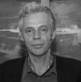
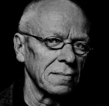
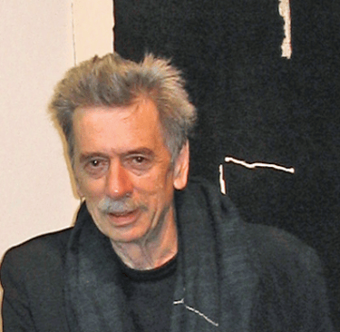
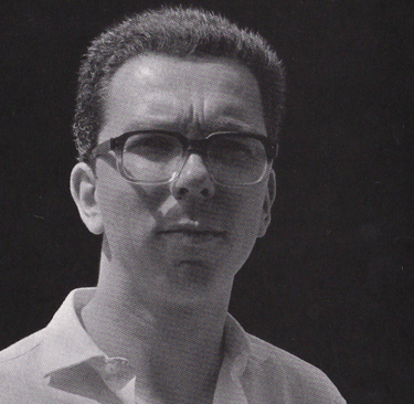
Frank van Hemert (1956)
Frank van Hemert - born in 1956 in Kerkrade, Netherlands. From 1975 to 1979, he studied at the TeHaTex in Tilburg, and from 1980 to 1982, he attended Atelier 63 in Haarlem. In the early 80s, he was discovered as a young talent and received an invitation from curator Rudi Fuchs to participate in Documenta 7 in Kassel. His works are represented in numerous museums, private and public collections.
The versatility of his work, both on canvas and on paper, is evident in the extensive series he has created on the most important themes of life, such as death, suffering, isolation, love, erotic experiences, and the question of one's own identity. Frank van Hemert uses both non-objective and figurative directions. In some works, the figurative echoes are so strong that the balance between figure and ground threatens to fall apart. By detecting the aura of his figures, he strives to find a physically tangible force, which he expresses through his mastery of painting.
Tineke Porck (1954)
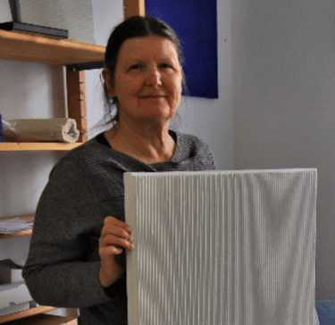

Tineke Porck's oeuvre is intimately tied to constructivism, zero, and minimal art. Her work distinguishes itself through a deeply personal character and an investigative, cohesive development. Both her early sculptures and her recent pieces exude a distinct set of principles. Rather than relying on mathematical foundations, her works are instinctively composed.
Consistently, Porck's forms, colors, and compositions display a modesty. Her playful originality within the constraints of constructivism, the experimental approach driven by a strong concept, the cohesiveness of her oeuvre, the artistry, and the authentic passion of Porck are key ingredients in attaining a high level of quality.
The works from the recent series 'Shifts' are what may be called "sculptural paintings." This series is the result of years of research into the conceptual and concrete visual arts.
All of Porck's work revolves around connections, space, and structure. The Shifts series investigates the effect of shifting identical elements and the significance of color, horizontal and vertical elements. The synergy between the individual elements and the space they occupy is crucial to the experience. The specific structure of the surface of the work also contributes to this. Painting and space unite to form a construction.
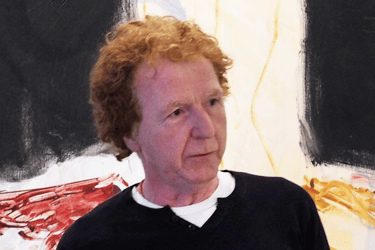
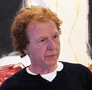
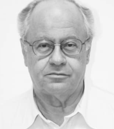
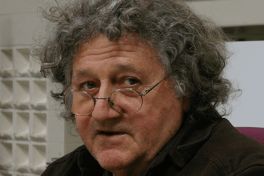
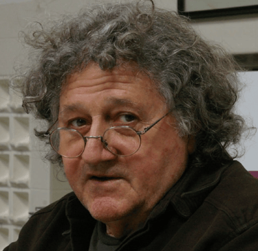
Arie van Geest (1948)
Arie van Geest (1948) resides and has his studio in Rotterdam. This city is where he honed his skills at the Academy of Fine Arts in the 1960s. A versatile artist, his expertise spans various mediums including graphic design, drawing, painting, and mural art. Having also taught for thirty years at the art academy in Rotterdam, van Geest's work is known for its imaginative worlds and scenes. He draws inspiration from literature, particularly the dark fairytales of the Brothers Grimm and Charles Perrault. During his studies, van Geest received advice from his teacher Klaas Gubbels to paint what he envisions, rather than what he sees
This is what van Geest says about his work
Halfway through the sixties, I discovered Lewis Carroll's Alice's Adventures in Wonderland & Through the Looking Glass and What Alice Found There, Comte de Lautréamont's Les Chants de Maldoror, and Bob Dylan's double LP Blonde on Blonde, released in 1966.
These three narratives serve as the foundation for the paintings I have been producing since 1968. Deceased Hans Sonnenberg, manager of Gallery Delta Rotterdam, with whom I collaborated between 1973 and 2017, referred to me as a typical representative of everyday mythology. My visions of paint are rooted in both language and image. In a sense, I experience painting as a gentle form of schizophrenia.
Each painting contains the blueprint for the next canvas. From the start of my career, series have been created regularly. Some within the span of a week: Tableau Mourant (1984), while others, such as The Broken Promised Land (TBPL; 2012-2019), took years to complete.
Both FTN and S&O art collections have works form Arie van Geest in their collections.
"I paint to clarify my relationship with things and the world," declares Toon Teeken. The artist, painter, and draftsman, born in 1944 in Heerlen, incorporates in his drawings, gouaches, and paintings the relationships between his inner world and the perception of the absurd outer world. To achieve this, Teeken uses new symbols and cliché images, to which he adds new meanings.
His inspiration comes from language, letters, signs, photos of dancers, and images of renowned artists and musicians. These sources inspire him to defy the often-used motto 'Less is more'; his swirling world of people, animals, cartoon characters, and Pinocchio in vibrant colors embodies Teeken's motto of 'More is more'.
The trips the artist has made to Africa and Suriname have influenced him to apply new motifs and compositions in his creations. As a result, black men wearing masks and props are depicted dancing and fighting on the horizon of the African landscape. Colors from the Surinamese rainforest are combined with the visual composition of the Italian Renaissance and Baroque art in Rome and Florence.
Another source of inspiration for Teeken are the retrospective exhibitions of writer and artist Marcel Broodthaers in Brussels. He feels a connection to the ideas of this remarkable visual and language artist. This is why he has incorporated Broodthaers' portrait multiple times in his paintings. Teeken has exhibited his work at various locations including the Museum Het Valkhof in Nijmegen, the Stedelijk Museum in Schiedam, the Stadsgalerij Heerlen, the Bonnefantenmuseum in Maastricht, and the Vrije Universiteit in Amsterdam. His art has been included in the collections of museums, businesses, and institutions such as the Centraal Museum Utrecht and the Museum van Bommel van Dam in Venlo. Multiple books have been written about the artist, such as "More is More" published in 2006, but he himself has also worked on photobooks for over forty years. Teeken, who received the Royal Grant for Visual Arts in 1978, currently resides and works in Maastricht.
Toon Teeken
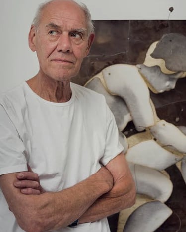
"What do I want to achieve with my art? What I want to achieve with my life! Tension & calm, love & hate, order & chaos, success & deception. In short, EVERYTHING and therefore NOTHING. I am not aiming to reach a specific place with "my art," but rather, I am constantly moving towards and away from something," writes Ploeg during his studies at the Gerrit Rietveld Academy. In the same note, he describes 'tradition' as nothing more than a series of images and objects collected by art historians in books and museums. He wonders what they may have overlooked.
Quest for abstraction
The exhibition at Kunstmuseum showcases a cross section of Ploeg's entire oeuvre: alongside around seventy paintings, there are also video clips and abstract video art. In the early years, Ploeg is part of the Nieuwe Wilden (New Wild Ones) movement and produces neo-expressionist works, raw and colorful. Later on, he develops a unique visual language, rich in imagination and often bringing a smile to the viewer's face. The artist searches for abstraction and frequently chooses bright colors and simple, mostly geometric forms. The digital forms he discovers in his computer art later on influence his painting. In contrast to the prevailing trend at the time, his work becomes more abstract and incorporates elements of De Stijl, Picasso, and cubism, as well as suprematism (Paul Mansouroff). However, Ploeg never fully achieves abstraction in his painting. As he acknowledged himself, there is always a face that creeps in.
Maarten Ploeg
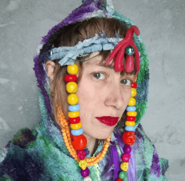
Ellen Schippers is a multi-disciplinair artist, who works as a fashion designer, video-artist and photographer. She creates Performances with Wearable Sculptures and Art Theater. Besides she realizes theatrical installations with videos and photos.
Schippers art is about female images, the ideals of beauty and about the cradiction between self-image and authenticity.
She creates inner portraits of women in a mysterious atmosphere, which gives the viewers room for their own associations and emotions.our text here...
Ellen Schippers
Philip Smith (1952)
Philip Smith's artistic creations are painstakingly crafted through a unique blend of photography, drawing, and painting. His distinct language of portraying marks and imagery stems from an expansive collection of 35mm film negatives. These negatives are utilized by the artist to capture diagrams, illustrations, and symbols borrowed from a diverse range of cultural sources, including 1950s Cold War espionage guidelines, mystical texts, advertisements for lingerie, and charts of numerology.
To bring his vision to life, Smith diligently applies layers of wax or a gesso medium to the canvas, creating a rich and textured surface. He then begins the creative process by sketching out the composition with oil pastels, only to deconstruct it later through a meticulous process of erasure. The result is a thought-provoking and strangely unfamiliar piece of art that encapsulates the untapped potential of these visual fragments. Through his masterful use of pigment, surface, and scale, Smith expertly hints at the presence of the enigmatic and the unseen.
Joris Geurts (1958)
Joris Geurts, renowned for his lyrical abstract paintings, drawings, and prints, has dedicated himself more to creating works on paper in the last decade. They are made with acrylic paint, diluted with a lot of water, and applied with broad brushstrokes on various paper sizes. These watercolors are transparently layered and traceable, with deep purplish blue tones, gray shades, and yellowish-green colors evocative of the cosmos or the landscape. In this exhibition, he showcases a new series of works on paper.
Born in Oss (Netherlands) in 1958, Geurts studied at the AKI in Enschede. After his studies, he began his career in the early 1980s at Art & Project Gallery in Amsterdam. Since 1995, he has consistently exhibited at Slewe Gallery. In addition to his painting practice, he also works as a composer of music. His works have been collected by various important public collections, such as the Stedelijk Museum Amsterdam, Museum Boijmans van Beuningen in Rotterdam, Rijksmuseum Amsterdam, Rijksmuseum Twenthe in Enschede, Noordbrabants Museum in Den Bosch, as well as private collections including AkzoNobel, ABNAMRO, KPN, BPD, and AEGON.
Robert Barry, considered one of the pioneers and the most representative artists of the Conceptual Art movement, was born in New York City in 1936 and completed his B.F.A., M.A. at Hunter College, The City University of New York. He lives and works in New Jersey.
Around the middle of the ’60s, Barry starts investigating the space around the canvas as well as the space within and the placement of the work in the exhibition context as a primary component of the artistic operation. Transcending the physical limitations of space and material, Barry has produced non-material works of art, installations, and performance art using a variety of otherwise invisible media (including radio waves and telepathy), challenging what would be accepted as “typical” artistic practice or experience. The artist questions the limits and the true nature of perception, our senses possibilities in relation with often unknown and intangible elements.
In the early ’70s Barry decides to focus on the word, as a unique vehicle of meanings and privileged tool of communication. The words in capital letters, painted on a canvas, written on walls or surfaces, printed on paper, projected on slides or carved, evoke narrative and inspire contemplation. Fundamental for the artist is the specialization of the word, the relationship between this and the emptiness around it.
Barry encourages free association of meaning to his works. Faced with a great variety of meanings and signifiers, the fundamental constant of all his research remains the fact that between his mind and the public’s gaze, there is a passing of ideas and concepts, not pre-established and intentional messages: a point of arrival and a departure that becomes the real creative engine of his work. To Robert Barry “art is a language and has roots in the language”.
His work has been included in epoch-making exhibitions such as Live In Your Head: When Attitudes Become Formcurated by Harald Szeemann at the Kunsthalle Bern and The Institute of Contemporary Art, London (1969) and Documenta V (1972). Since then, he has shown in innumerable important exhibitions all over the world including the landmark show, Reconsidering the Object of Art at LA MoCA (1995).
From the early 1970s, Barry has been the subject of various solo shows at important venues including the Tate Gallery, London (1972), the Stedelijk Museum, Amsterdam (1974), Museum of Conceptual Art, San Francisco, California (1978), The Renaissance Society, University of Chicago (1985) and the Stadtische Galerie im Lenbachhaus, Munich (2001). 2003/04 saw a comprehensive retrospective and accompanying catalgoue of his early work, A Place To Which We Can Come, Works from 1963 to 1975 at the Kunsthalle Nürnberg, Nürnberg, Germany and Aargauer Kunsthaus, Aarau, Switzerland.
Barry’s work is included in the permanent collections of renowned museums including the Museum of Modern Art, New York; the Hirshhorn Museum and Sculpture Garden, Washington, DC; the Solomon R. Guggenheim Museum, New York; the Musée d’Orsay, Paris; the Whitney Museum of American Art, New York; the Musée National D’Art Moderne, Centre Georges Pompidou, Paris; the Museum of Contemporary Art (MOCA), Los Angeles and the National Gallery of Art, Washington, DC.
Merely one visit to Ossip's studio is sufficient to understand the type of work he creates. You walk through this installation with hanging and standing figures, and are both literally and figuratively thrown off balance. Photos on display are suspended from the ceiling with chains, such as a man in a suit with an old-fashioned bowler hat, with two women's shoes positioned underneath him. Other figures stand on a platform on the ground, or hang from the walls. Three nude women are connected to each other with a rope, and are all fixed in place with wire structures to an iron. Others stand on a stool, a book, or a lampshade.
Ossip uses old (portrait) photos, sourced from medical books or yellowed magazines and newspapers, particularly from the early twentieth century. It is not the context of the photo that interests him, but rather the image itself. The images provoke a sense of strangeness, as they often depict people with physical deformities, but also because they have been removed from their old, historical context, such as the photos of classical beauties. He then enlarges and edits the images, placing them in the present. The original image is still visible, but it takes on a new meaning. He restores the lost spatiality by using strings or wire, or by adding an animal bone or a piece of fabric. Accents are highlighted, and powerful images are created. In this way, he creates a completely different world in which the viewer can give their own interpretation to these new images. Ossip works associatively; the texts placed on his works may have a relationship, or they may have none at all. His unorthodox method is not based on an ideology or an art historical style. He wants to avoid any form of pompousness; art should speak for itself. Ossip's work is intriguing, often oppressive, challenging, and provides enough food for thought.
Piet Dirkx (born in Eindhoven, 1953) underwent a period of study between 1971 and 1983, consecutively at the Academy of Fine Arts (Arendonk), the Academy of Visual Arts (Tilburg), the National Higher Institute of Fine Arts (Antwerp) and the Jan van Eyck Academy (Maastricht). Dirkx's oeuvre is a perpetual exploration of form and color, often through a fusion and interweaving of texts and drawings fused together in the form of installations or transformed into "wall pieces" from his notebooks and cigar boxes.We have one of the largest collections in the Netherlands of works by Piet Dirkx. Including many monumental paintings from the BIOTOOP installation. For more information please inquire.
Raquel Maulwurf (Madrid, 19 May 1975) is a Dutch artist. Maulwurf spent her childhood alternating between the Netherlands and Spain. She studied at the Academy of Fine Arts (now part of the ArtEZ University of the Arts) in Arnhem from 1993 to 1997, and then pursued a multimedia course at the SAE International Technology College in Amsterdam from 2001 to 2002. She has gained recognition for her charcoal drawings, which focus on the destruction of city and landscape. The size of her drawings ranges from tiny A4 to wall-sized works. It is worth noting that her drawings are presented in an organized series. The Trümmerfelder series consists of over one hundred drawings. Through archival research, photography, and interviews with survivors, Maulwurf attempts to capture the devastating effects of bombing and other acts of war through her charcoal drawings. People do not appear in her work. Instead, the white space of the drawing paper or cardboard is filled with a raw impression of destroyed architecture, depicted through rough charcoal lines. This has resulted in drawings of cities like Rotterdam, Nagasaki, Auschwitz, Dresden, Berlin, and Guernica. The series FLAK (Flugabwehrkanone), New York City 11/9, and Zeppelins are presented on black mat board, with its surface scratched to portray destruction. The series Favela, created in 2005 in São Paulo, depicts the constant spatial transformation of the slums in this city.
In addition to charcoal drawings, Maulwurf also works with woodcuts. Her technique is uncompromising: every color that is not covered by another layer is cut away. Maulwurf's work has been featured in numerous solo and group exhibitions in Tokyo, London, Milan, and Berlin. In the Netherlands, the Stedelijk Museum Schiedam exhibited some of her works from the Trümmerfelder series in 2007 as part of the exhibition 'Drawn to destruction'.
Arno Nollen (1964) is a storyteller. In his exploratory work, the focus lies on the photo series; he is not interested in a single standalone photo. These photo series, with subtle nuances at times, exist in a blurry area between film and photography. Through repetition, they unconsciously trigger associations, comparisons, and memories within the viewer. Emotions ranging from fascination, excitement, disapproval, to unease arise, and the viewer's own story is created. Nollen utilizes various media to present his images, such as books, videos, prints, and installations. For the Hague Museum of Photography, he created eight new photo series using hundreds of photos from his archive (1997-2016), forming the impressive installation Just.
Collector of emotions Nollen works without a specific concept or method, calling himself a "collector of emotions." The only criteria for Nollen is the precision with which he portrays his emotions through his images. It is almost palpable how his personal doubts, obsessions, and tenderness often align with those of the subjects he photographs. In the series characterized by minimal differences and shifts in pose, gaze, and action of the model, giving them an almost cinematic quality, Nollen seeks to compare moment to moment. Enhanced observation skills are essential for Nollen.
Arno Nollen graduated from the Gerrit Rietveld Academy in Amsterdam in 1997. He received the Esther Kroon Award for his graduation presentation and was nominated for the NPS Culture Prize in 1998. He exhibits.
Melanie Bonajo (they/them/theirs) is a multifaceted individual, embodying the roles of artist, filmmaker, sexological bodyworker, somatic sex coach, educator, cuddle workshop facilitator, and activist. Through the mediums of videos, performances, photographs, and installations, they delve into the intricacies of coexistence within a suffocating capitalist system. Their works address themes of diminishing intimacy and isolation in an increasingly sterile and technologically-driven world. By thoroughly researching the impact of technological advancements and commodified pleasures, they expose the roots of alienation and disconnection from a sense of belonging. In response to this, their creations put forth anticapitalist methods for healing and exploring sexualities, intimacies, and emotions. In their experimental documentaries, Bonajo often shines a spotlight on communities living on the fringes of society - either through unlawful means or cultural isolation. Through their keen observation, they reveal the paradoxes of comfort and the complexities of community, equality, and body politics. As a pioneering force, they have spearheaded the collective known as Skinship - a touch-based haven for kinship, providing an inclusive space for all bodies to learn and experience somatic touch and intimacy.
Gerard Verdijk (1934 - 2005) was an enigmatic figure in the post-war Dutch art scene. His abstract works, both on paper and canvas, were renowned among national and international museums, who avidly added them to their prestigious collections. Notably, major retrospectives were held at distinguished institutions such as the Museum Dordrecht, Noord Brabants Museum, Kunstmuseum The Hague, and the Stedelijk Museum Amsterdam.
Throughout his extensive career, Verdijk relentlessly forged his own path as an artist, drawing inspiration from various sources. His eclectic mix of influences included the international abstract movements of the 1950s, as well as Oriental philosophy and his encounters during travels to Africa, Japan, and America. Such diversity in inspiration resulted in a body of work that defied categorization into a single movement.
In 1994, Verdijk relocated to the tranquil French countryside, which marked a significant turning point in his artistic practice. Here, he masterfully combined elements from his previous works on paper, universal symbols from ancient cultures, and profound philosophical insights gained from his travels. The result? A true maturation of Gerard Verdijk's artistic vision.
Deepening his philosophical approach, Verdijk's artworks showcased a heightened sense of connection between the depicted objects and the surrounding negative space. A palpable duality emerged, blurring the boundaries between concrete objects and the void that enveloped them, between the shadows and the objects that cast them. Verdijk's late paintings revealed great restraint through minimalist compositions, at the same time, brimming with layered and evocative colors that filled the voids around the solid objects and shapes.
Gerard Verdijk (1934-2005)
Fons Brasser (1944)
Fons Brasser is an artist who expertly wields various media such as drawings, collages, sculptures, and photography. His work exudes a scientific fixation and meticulous organization, evident in all his pieces regardless of the medium.
This method is further accentuated by his tendency to work in series, following a logical sequence that can span over years. Through his exploration of surface, shape, space, and size, Brasser strives to create formal structures that are aesthetically harmonious and visually coherent.
His artistic scope is confined to simple and geometric shapes, with a particular fondness for the square. For instance, he dedicated years to producing a series of pentagonal drawings.
Brasser's process involved drawing a diagonal line from one side to a corner, which then served as the side for another square. His sculptures and reliefs can be seen as compositions of these meticulously drawn shapes. The perspective of the viewer plays a crucial role in the interpretation of these pieces. A slight variation in the viewer's viewing angle can create an entirely new composition, demonstrating the complexity of Brasser's work. Moving from his early background in documentary photography, Brasser has now shifted towards a more artistic and aesthetic approach, placing emphasis on the subject matter and the visual appeal of the image.
In the contemporary world of Dutch photography, Fons Brasser's collection stands out as a distinct and somewhat secluded entity. Like a scientist, Brasser delves deep into the subject matter, often focusing on the history of architectural installations. After 1988, Brasser turned his lens toward capturing the interiors of Dutch water towers, trying to find common threads and unique distinctions in their construction.
Bruno Bruni (1935)
Bruno Bruni senior, born in the quaint coastal town of Gradara, Italy on November 22, 1935, is a multifaceted Italian artist known for his lithography, graphic art, painting, and sculpture. His career reached commercial success during the 1970s and his talent was soon recognized on a global scale, earning him the prestigious International Senefeld award for Lithography in 1977. With a history of acclaimed exhibitions in Germany and a reputation as one of the most renowned Italian artists in the country, Bruni continues to awe audiences with his distinct style.
From his humble beginnings as the son of a railway attendant, Bruni showed a passion for art from a young age. He honed his skills under the tutelage of Giuliano Vanghi and furthered his formal education at the Art Institute in Pesaro from 1953 to 1959. It wasn't until he moved to London that he found his niche in the realm of pop art. After a successful exhibit at London's John Whibley Gallery, Bruni's fate was sealed when he met a girl from Hamburg and followed his heart to Germany. Enrolling at the renowned Hochschule für bildende Künste Hamburg marked a turning point in his career, and he has resided in the city ever since, returning to his hometown periodically to stay connected to his roots.
Bruni's artistic prowess has garnered him considerable recognition in the international art scene, earning him acclaim as a draftsman, lithographer, painter, and sculptor. In 1977, he was the proud recipient of the International Senefeld Competition for Lithography, solidifying his position as a master in his craft. Rooted in the expressionist movement, his work is heavily influenced by the likes of Otto Dix and George Grosz, as well as the great masters of Italian art. At the forefront of his artistic approach is his unique method of painting directly onto the stone, setting him apart as one of the few lithographic artists to do so. His works often feature erotic depictions of the female form, a testament to his artistic philosophy that disregards abstract trends in favor of staying true to his own vision. Today, Bruni resides in a converted 100-year-old swimming pool that serves as his living space, studio, and gallery. His art is sold through his wife's gallery in Hanover, solidifying his position as one of the highest-earning artists in Germany.
Janpeter Muilwijk (1960)
in paradisum
IN PARADISIUM, I have been captivated since my early childhood. Oh, how I long to frolic naked, without shame, in harmony with all that surrounds me in this idyllic paradise.
The unfortunate occurrence of the Fall of Man initially enraged me. I was not angry with Eve or Adam, but rather with the imperfections of paradise itself. Doubts about an omnipotent being who could have prevented or chosen to prevent such an event left me grumbling. Shouldn't paradise be perfect?
Through these questions, I created paintings, drawings, and tapestries. Eventually, I let go of my frustration. The personal responsibility that came with the knowledge from the forbidden fruit also has its positive aspects. Eve gains conscious thoughts from eating the fruit, and Adam follows suit, making life more thrilling.
The carelessness and exotic erotism of the Garden of Earthly Delights then appealed to me for a while. In my latest work, the paradise garden embodies our primordial origins that are inherently embedded in our genes.
At times, we can catch a glimpse of this past in the present, though its fragility makes it easy to disrupt. It is good, but not perfect. Unexpectedly, we can stumble upon it in amazement of life, but it also manifests in the calmness of our mind without fear of death, as in the In paradisum of a funeral mass.
These ideas about the extremes of our beginnings and endings as human beings are nourished by brief experiences of paradise in the present.
Look! In our daily lives, our paradisiacal origin reveals itself unexpectedly, feeling like the serenity of our soul.
Janpeter Muilwijk, May 2014
Fon Klement (1930-2000)
Fon Klement was a self-taught artist, learning his skills through dedication and hard work. Initially gaining recognition as a representational painter and woodcarver, he later delved into the realm of multicolor printmaking in his signature woodcut technique. Gradually, familiar elements gave way to more abstract motifs, rendered in a subdued color palette. A retrospective of his work was featured in the Museum Van Bommel-Van Dam in Venlo in 1980.
In the 1980s, Klement's work embraced vegetative elements, characterized by vibrant shapes and colors. To commemorate his sixtieth birthday, a new collection of his work was exhibited at the Singer museum in Laren in September 1990. Along with gallery shows, his prints have been featured in traveling exhibitions all over Europe since 1961, when he became a member of Xylon, the international association of woodcarvers. Notably, his work was showcased in the Prints today in the U.S.A. exhibition, which toured the United States for several years and featured graphic prints by Dutch artists, including Fon Klement. His contributions have also been recognized by the public, as he was awarded the audience choice award at the Grafiekbiennale Grafiek nu in Laren in the fall of 1990, followed by another accolade at the International Graphic Biennale in Maastricht in the summer of 1993.
Fon Klement's work cements his position as one of the most renowned artists of our time.
Guillaume Le ROY (1938-2008)
Guillaume le ROY (Blaricum 1938 - Amsterdam 2008) was a multifaceted Dutch artist known for his expertise in the mediums of printmaking, wood engraving, etching, drawing, and textile art.
His artistic journey began at the School for Arts and Crafts in Amsterdam in 1957, now known as the Rietveld Academy, where he focused on the department of free graphics. In a creative twist, he repurposed discarded cafe tables from De Hoefslag restaurant as the base for his first woodcuts. After graduating in 1962, he spent over two years in Paris with his family, immersing himself in international art circles.
Throughout his career, Le Roy's prints remained infused with his signature abstract style. However, he occasionally incorporated hints of color to accentuate windows, gates, and doors. For him, the colors of black, white, and gray held the utmost importance in his works. He did venture into a period of using more colors from the 1960s-1979, only to return to his monochromatic palette. According to various art critics, Le Roy was a true printmaker, devoted to the technique of carving with a knife and using corrosive acids.
His talent did not go unnoticed, and he received numerous invitations to exhibit his work in and outside of the Netherlands starting from 1965. In 2010, the Cobra Museum in Amstelveen paid homage to his legacy. His work continues to be displayed in the Stedelijk Museum in Amsterdam and the Museum of the Book in The Hague.
Oliver Boberg (1965)
Sinds eind jaren negentig maakt Boberg fotowerken in kleur van zakelijke en altijd van menselijke aanwezigheid verstoken stedelijke doorkijkjes. Recentelijk heeft hij het medium film aan zijn beeldend vocabulaire toegevoegd. Het zijn een soort stilstaande foto’s met een minimum aan beweging en geluid, die altijd in een monochrome, nachtelijke setting zijn opgenomen. De dikwijls landschappelijke scènes lijken net buiten de stad gesitueerd te zijn: een stalen brug met dwarrelende sneeuw, een fabriek met stoomuitlaat, een buitenwijkweg in regenflarden of een donker parkbos in opkomende mist. In de tentoonstelling worden deze 16 mm. films in de vorm van gedigitaliseerde projecties op grootformaat en bij toerbeurt op drie verschillende schermen geprojecteerd. De minimale aanwezigheid van geluid en beweging veroorzaken een maximaal dramatisch effect: Bobergs films zijn vreemd en omineus omdat ze geen begin en einde hebben, en dus eigenlijk scenarioloos zijn. Oliver Boberg (Herten, 1965) studeerde in 1993 af aan de Kunstacademie van Nürnberg. Zijn werk is voornamelijk bekend in Duitsland en de Verenigde Staten. Bobergs concept van een gefotografeerde en gefilmde ‘geconstrueerde werkelijkheid’ wordt gedeeld door andere, op dit moment succesvolle kunstenaars-fotografen-filmers als Thomas Demand, Lois Renner, David Claerbout en Edwin Zwakman.
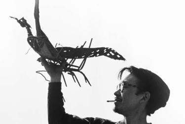
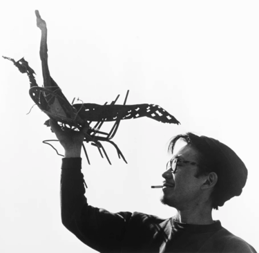
Shinkichi Tajiri (1923-2009)
Shinkichi Tajiri, born on 7 December 1923 in Los Angeles to Japanese parents, was known primarily as a sculptor, though he also dabbled in photography and earned recognition for his award-winning films, videos, stereo and panoramic photos. His artistic legacy is a fusion of Asian, American, and European influences.
After World War II, Tajiri enrolled at the Art Institute of Chicago (1947-1948) before relocating to Paris. There, he studied under renowned sculptor Zadkine and later painter Léger. Tajiri was an early pioneer of junk sculptures, gaining admiration from the Dutch CoBrA artists living in the city. He was invited to participate in the first and second International Exhibition of Experimental Art (CoBrA) at the Stedelijk Museum, Amsterdam (1949) and Museé des Beaux Arts, Liège (1951), respectively.
In 1956, Tajiri moved to Amsterdam and later settled at Kasteel Scheres in Baarlo near Venlo with his wife, Ferdi, and their two daughters in 1962.
Tajiri was renowned for his artistic versatility while living in the Netherlands. He represented the country at Documenta II (1959), Documenta III (1964), Documenta IV (1968), and the 31st Venice Biennale (1962).
In 1969, Tajiri was appointed as a professor at the Hochschule der Künste in Berlin by his art students, where he remained a professor until 1989. During this time, he experimented with various media, including his own off-set printing press (X-Press), forgotten photography techniques, like Daguerreotypes, and computer drawings on the Commodore Amiga.
Following Tajiri's passing, the newly renovated Rijksmuseum (2013), Amsterdam acquired two of his sculptures, "Made in USA" and "Ferdi's Wombtomb," which are permanently on display in the museum's 20th-century collection.
Jan Wiegers 1893-1959
At the young age of thirteen, Jan Wiegers was enrolled as a student in the three-year introductory course at Minerva. Due to health reasons, he had to cancel his sculpting lessons and shifted his focus to painting. After completing his studies, he traveled to Germany in 1911 to work and in 1912, he attended the Sonderbund exhibition in Cologne, a prominent international display. He returned to the Netherlands in 1914 and continued his education at the Minerva Academy. He also took classes at academies in Rotterdam and The Hague. In 1918, Wiegers was one of the founders of De Ploeg.
In 1922, Wiegers received invitations to exhibit his work in Paris and Antwerp. In 1923, he became the chairman of De Ploeg and later served as vice secretary. He was highly active in the organization. In 1930, he resigned for a year due to a conflict. Together with Van der Zee, he proposed the international exhibition in Groningen in 1933 and played a crucial role as the secretary in preparations. He also exhibited his work in Budapest in 1933. In 1934, Wiegers moved to Amsterdam, but he remained a member of De Ploeg. After World War II, he participated in De Ploeg exhibitions until 1948.
Even before 1920, Wiegers experimented with various modern styles. It is likely that the seed of Kirchner fell on a plowed field. At his first Ploeg exhibition after returning to the Netherlands, Wiegers made a large submission and amazed the critics. Under his influence, the Ploeg members developed a collective style that lasted until around 1927. According to Hofsteenge, this period is generally considered the most significant for De Ploeg.
Peer Veneman (1952)
The artist known as Peer Veneman is not just a sculptor, but a painter, draftsman, graphic artist, and assembler as well. He received formal training at the Sint-Joost Academy of Fine Arts in Breda and primarily focuses on three-dimensional works.
Since the 1980s, he has been creating vibrant wooden sculptures that are neither figurative nor abstract. Later on, he also ventured into casting bronze sculptures. In 1999, he crafted seven pieces that represent each of the seven deadly sins: wrath, gluttony, lust, envy, sloth, pride, and greed.
Ten years later, Veneman created a series depicting the seven virtues. This theme often recurs in religious art and serves as a moral instruction to believers. As the artist himself claims, nobody questions the meaning behind a landscape painting, still life, or portrait. However, when it comes to virtues, everyone wants to know the reasoning behind it. A Breughel allegory about the seven deadly sins sparked his reflection. For Veneman, it is not just about the form, but also the narrative that gives shape to a standalone object. In his opinion, sculpture is always about the image, and he firmly believes in its power.
Towering at three meters tall, Veneman's bronze sculpture "Hovaardij" (Dutch for arrogance) stood in the middle of a square in Amsterdam-Zuid for weeks during the 2013 ARTZUID event. Its stature is that of a judge, stern yet impartial, facing the viewer with unwavering dignity. Yet, at closer inspection, it is evident that he has a swollen head. This symbolizes his pretentiousness, lacking any natural authority.
His works can be found in the collections of renowned institutions such as the Stedelijk Museum in Amsterdam, the Groninger Museum, the Noordbrabants Museum in 's-Hertogenbosch, the Kröller-Müller Museum in Otterlo, and the Textielmuseum in Tilburg. Additionally, numerous companies and private collectors have added Veneman's pieces to their prized possessions.
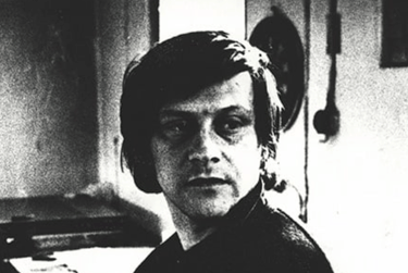
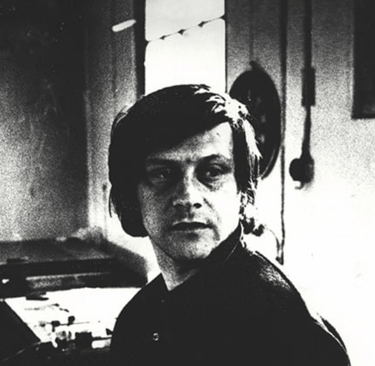
Gerald van der Kaap (1959)
Van der Kaap constructs and enacts, juggles and mixes. Poetry Emission Program (1997), designed by Van der Kaap on commission from the waste incineration plant AVI Twente, serves as an example of this. Various variables such as the temperature in the incineration furnaces, the weight of waste, and sensors in the road surface influence the 'program' developed by Van der Kaap, which then creates instant poetry based on these variables. On a large LED screen above the entrance gate of AVI Twente, texts such as "I want a permanent wave" and "your company was very pleasant" appear in big red letters.
Another example is the Automatic VJ Machine (1998), developed for pop venue 013 in Tilburg. A large projection screen hangs on the façade of the building, displaying a new visual story composed of Van der Kaap's video material. This visual story is constructed by allowing visitors to input song titles via a search engine. The words used in these titles generate a number of video fragments linked through a database.
Van der Kaap's video work is a combination of patterns, found footage, text, and flickering colors. What exists is cut into pieces, processed, and thus a melting pot of imagery is created, where meanings are loosened. He also plays with various layers of meaning in his photography by enacting scenes. For his project Passing the Information (2002), which is created during a stay in China, he has Chinese students reenact scenes he has previously seen and captured in reality.
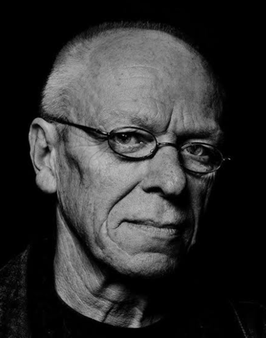
Günther Förg (1952-2013)
Born in 1952 in the outskirts of Allgäu, Germany, Gunther For̈g embarked upon his career in the early 1970s, as he began to study at the renowned Academy of Fine Art Munich. Throughout his education, For̈g honed a distinct pattern, grounded solely in tones of grey and black. These initial investigations into shades of gray, also known as "Gitter" paintings, marked the genesis of a life-long dedication to conceptualism. As he eloquently declared, "Grey, a void in itself: neither pure white, nor deep black. Hovering in between. Unconcerned with form. Embracing liberty." While the artist eventually incorporated splashes of color into his monochromatic creations, his use of grey served as a neutral foundation from which he manifested his magnum opus.
In the roaring 1980s, For̈g ventured into photography, capturing gorgeous images of architecturally significant structures, both culturally and politically, ranging from Bauhaus edifices in Tel Aviv to Fascist constructions in Italy. This diversification of medium and form influenced For̈g to forsake painting altogether, as he focused solely on photography for a period of time, as a counterpoint to traditional painting practices. In retrospect, he expressed that photography allowed him to "capture reality more intimately," concluding that "what one portrays is not necessarily the absolute reality." During the span of the 80s and 90s, Förg's photographic creations garnered critical acclaim and were showcased at esteemed art institutions worldwide, such as the Kunsthalle Bern in Switzerland and The Solomon R. Guggenheim Museum in New York, NY. It was during this period that Förg embarked on an exploration of the exhibition space itself, painting over gallery walls and juxtaposing photographs against his own paintings.
Förg ventured into a new phase of experimentation in the late 80s, delving once again into the realm of painting and delving into novel materials such as wood, copper, bronze, and lead. His celebrated lead series, in which acrylic paint is applied onto sheets of lead and supported by wooden frames, blurs the boundaries between painting and sculpture, marking an evolution towards object-making. Förg's bronze sculptural practice, also initiated in the 80s, possesses a painterly quality with indentations and marks that evoke brushstrokes, capturing a fleeting moment in time.
In his fervent pursuit of artistic experimentation, Förg turned to producing fragmented sculptures of body parts in the early 90s, describing this foray into figuration as inevitable. These new works embrace the inherent materiality of their creation; the weathered, heavy, and scratched surfaces of metal, lead, and wood hint at a duality of form and expression, geometry and spontaneity.
At the turn of the 21st century, Förg's artistry evolutionarily diverged from the strict principles of Minimalism. Taking a fresh direction, he infused his works with a vibrant color palette and a more emotive touch, manifesting in a series of grid-like imprints and intersecting hues. Known as 'Gitterbilder' (grid paintings), these pieces exhibit the same uninhibited freedom and sensuality that have drawn critical comparisons to the works of Cy Twombly.
Other creations from this period feature expansive canvases of negative space, punctured by bursts of bold brushstrokes and expressive marks. Förg's ultimate return to emotive painting signifies a sense of completion, a full-circle return to painting as a harmonious fusion of experimentation and artistic tradition. In the words of the artist himself, "I believe painting endures as a resilient practice; throughout its history, its essence remains relatively unchanged and it continues to thrive in the present. It is a timeless art form."
Massimo Rao (1950-1996)
Rao’s paintings, lithographs and drawings combined his own original and contemporary vision with influences from classic and Renaissance styles. He was inspired further by Nordic Mannerism and pre-Raphaelite approaches.
Recurring themes are seen in his paintings, including a woman, transformed into a Greek goddess and a man, dressed as an angel - sometimes hiding behind a moon. Rao was called "the Painter of the Moon" because he so frequently used the image of the Moon with his subjects, which include men, women, and asexual characters set in a surreal, dream-like dimension. Settings such as these were said to be the reflection of the inner tension of the artist, as well as the anxiety and the timeless solitude of man. There is often a sense of mystery to his compositions.
Rao was known for using ancient techniques for preparing and applying colors on canvas. Combining the use of tempera and oil paints in a single work, as he did in “Portrait” and “Shelter Made of Ashes & Recollections,” both on display here, was not a common method for his time. Rao was renowned for his implementation of ancient techniques in the creation and application of colors onto canvas. In his works, "Portrait" and "Shelter Made of Ashes & Recollections," featured in this display, he deftly combined the use of tempera and oil paints, a method uncommon during his time.
Born in 1950 in the quaint town of San Salvatore Telesino, situated near the bustling city of Naples, Italy, Massimo Rao's artistic pursuits led him to study art history in Benevento and architecture at the prestigious University of Naples. He graced numerous exhibitions in Italy, Switzerland, Belgium, Austria, The Netherlands, and the United States before his untimely passing at the young age of 46 in 1996. In honor of his remarkable talent, San Salvatore Telesino opened a museum dedicated to the artist in 2012, housing 65 remarkable works.
Ien Lucas (1955)
It all is about abstraction.
Abstraction in the art of painting is an ongoing journey.
Searching for the possibilities and boundaries of my paintings, composition, colour, shape, plane and space, detached from any reference or reality.
Materials and the image, everything that turns a canvas into a painting, can evolve from the unfamiliar and unexplored to the more well known domain and back.
The work reflects the daily interactions with painting. The searching for, executing of, preparing, inquiring, correcting, reflecting, registering, taking decision etc.
Where I have once begun from a strict set of lines and planes, restrictions were lifted gradually, and the unpredictable took shape.
Feeling and ratio collided.
The many and diverse artistic experiments resulted in a range of spectacular works with series such as ‘what’s up, what’s down’, ‘van achter, van voren’, ‘crosspoints’, ‘what’s behind’, ‘front attack’ etc.
Ian Hamilton Finlay ( 1925-2006)
Ian Hamilton Finlay (1925–2006), a multifaceted philosopher, sculptor, and poet, revitalized the classical tradition through a rich body of work that encompasses an array of creative forms, celebrating the enduring power of language. His diverse output includes prints, poems, books, inscriptions, neons, sculptures, permanent installations, and landscape design. As a pure conceptual artist, Finlay was attuned to the formalistic concerns of literary and artistic modernism, such as color, shape, scale, texture, and composition. For nearly four decades, he built his pieces using philosophical texts, myths, characters, and imagery from the past, skillfully juxtaposing them to create enigmatic and thought-provoking combinations. Finlay's adept use of syntax and narrative configuration masterfully blended refined distinctions with a poetic philosophy. His talent lay in breaking down complex ideas into concise words and phrases, often laced with his characteristic wit and wry humor.
In 1961, Finlay co-founded the Wild Hawthorn Press with Jessie McGuffie and quickly gained international recognition as Britain's leading concrete poet. His publications continue to be instrumental in disseminating his visual art. As a sculptor, he collaborated with skilled artisans in a wide range of materials, bringing his ideas to life through stone carvings, constructed objects, and neon lighting. In the mid-1960s, Finlay resided and worked in Stonypath, situated in the southwest of Edinburgh. Here, he transformed the surrounding rural acres into a one-of-a-kind garden and lifelong endeavor: Little Sparta. Ian Hamilton Finlay passed away on March 27, 2006, at the age of 80.
David Urban (1966)
David Urban is widely considered to be the foremost Canadian painter of his generation. Born in Toronto in 1966, he studied both poetry and painting at York University, graduating with a BFA in 1989. In 1991, he completed a master's degree in English literature and creative writing at the University of Windsor under the tutelage of Alistair MacLeod. He later pursued a second master's degree in painting at the University of Guelph in 1993.
Urban's works can be found in numerous private and public collections, including the esteemed National Gallery of Canada. In 2002, he curated Painters 15, a groundbreaking exhibition featuring established Canadian painters that was prominently displayed at both the Shanghai Museum of Art and the Museum of Contemporary Canadian Art.
The artistry of David Urban is characterized by bold collisions of line and shape, striking uses of color, and dynamic brushstrokes. With every layer, Urban's paintings build into a captivating borderland between abstraction and representation. His rhythmic geometries evoke imagery of interconnected boards, beams, and girders. These improvizations seamlessly integrate elements of still life and landscape, as well as elements of both abstraction and realism, within an abstract framework. Urban's forms are masterfully crafted to challenge the viewer's perception, as he continually explores the mysteries of how and why we see.
Through his paintings, Urban delves into themes of music, childhood, and the power of imagination, capturing the essence of his artistic journey. He is deeply entrenched in the history and techniques of paint, and his work reflects this profound connection. Aside from his talents as a painter, Urban is also a gifted poet and musician, proficient in multiple instruments, and often explores the physical manifestation of sound through his work. His art effectively navigates the delicate balance between representation and abstraction, while maintaining an innate sense of connectivity and rhythmic structure. By seamlessly merging elements of both reality and abstraction, Urban creates a harmonious composition that is truly mesmerizing.
Roland Topor
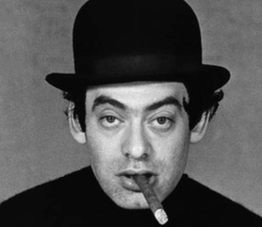
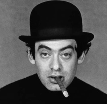
Roland Topor was a French savant renowned for his multi-faceted talents in illustration, caricature, graphic art, fine art, novel writing, drama, screenwriting, film production, and acting. His art is often linked to surrealism and he was a part of the Panic Movement, alongside Alejandro Jodorowsky and Fernando Arrabal. "I am abruptly aroused by a sense of impending catastrophe. Pulling down the sheets, I come across a cadaver in my bed, the carcass of a diminutive yet corpulent man, of the same age as mine. My first instinct is to rush to the telephone and alert the authorities. But I hesitate; the presence of this decaying corpse in my bed is awkward. I will be interrogated for explanations I am incapable of providing. They will accuse me of a heinous crime," he once mused, showcasing the dark wit and existential angst that pervades his creations. Born in 1938 in France, he resided in Savoy, France, and passed away in 1997. He pursued his studies at the École des Beaux-Arts in Paris. His pieces have been showcased in esteemed institutions such as the LVR-LandesMuseum Bonn, the Kunstmuseum Wolfsburg, and the Universalmuseum Joanneum.
Günter Tuzina (1952)
The highly refined paintings and drawings of Tuzina showcase the legacy of the minimalistic idiom from the 1960s and 1970s. His rectangular paintings, predominantly in dark blue, red, and green hues, resemble windows. They are intersected by expressive horizontal, vertical, and diagonal lines, which are not perfectly straight. This imbues the work with an emotional weight, a romantic expression. One can also clearly observe the construction of the paintings. As Tuzina himself states, "I find it crucial for the traces of the making process to be visible."
Günter Tuzina was born in 1951 in Hamburg (DE). He currently lives and works in Düsseldorf. His works have been internationally exhibited and collected in various prominent museum and public collections. His first museum exhibition was in the Netherlands, at the Van Abbemuseum in Eindhoven in 1978, followed by a solo exhibition at the Stedelijk Museum in Amsterdam in 1983. In 1985, he was invited for an exhibition at the Kunstmuseum in The Hague, where he created a mural in the staircase. Since then, the Kunstmuseum has acquired his works throughout the years and organized several exhibitions, including one in 2002, which also featured a catalog providing an overview of his oeuvre.
Rob Birza
Rob Birza was born in Geldrop, Netherlands and pursued studies at de Ateliers in Amsterdam. His artistic creations have been extensively showcased in numerous solo exhibitions, as well as in both national and international group exhibitions. His works have been acquired by both private and public collections, and he currently resides and creates in Amsterdam.
Birza's career has been nothing short of impressive, with two solo exhibitions at the renowned Stedelijk Museum Amsterdam in his twenties, and a continuous stream of exhibitions throughout Europe over the past four decades. He has also been commissioned for numerous public art pieces all across the Netherlands.
At first glance, Birza's body of work may seem perplexing; playful twists on Stella's shaped canvases and Schwitters-esque abstract compositions are interspersed with vibrant still lifes of flowers and grand depictions of the Afghan war. As curator and director Ann Demeester of the Frans Hals museum pointed out when introducing Birza's 2016 series titled "Shifting Circles," there is always one constant throughout his oeuvre: the delicate balance between the abstract and the figurative. This balance is prominently displayed in the "Shifting Circles" series through a clever interplay between background and foreground, and a structured system in which the colorful circles seem to adhere.
In his most recent series, "Drifting Circles" (2017), Birza has chosen to break away from symmetry and take a more relaxed approach to his circle system. The artist fearlessly embraces a laid-back and mischievous attitude in order to subvert his own system, as well as the larger artistic tradition. This rebellion opens up new possibilities and opportunities, and it is precisely this type of anarchy that played a defining role in the development of abstract art.
For more information on artists and their art
For inquiries about our collection or artists, please reach out. We love to share our passion for art and connect with fellow enthusiasts.
Reach
wilfriedvandenelshout@gmail.com
Art
Celebrating the journey of art and collecting.
contact info
Explore
ftnbooksandart@gmail.com
+31 0647506432
© 2025. All rights reserved.